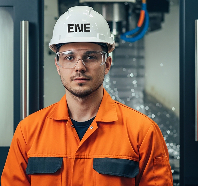
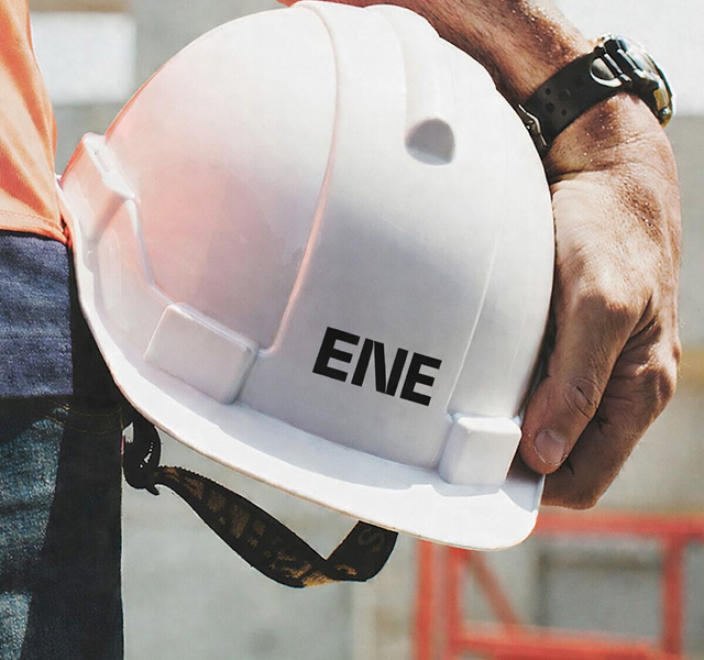
Ene
Industry
ADVANCED MANUFACTURING
Year
2025
Scope of work
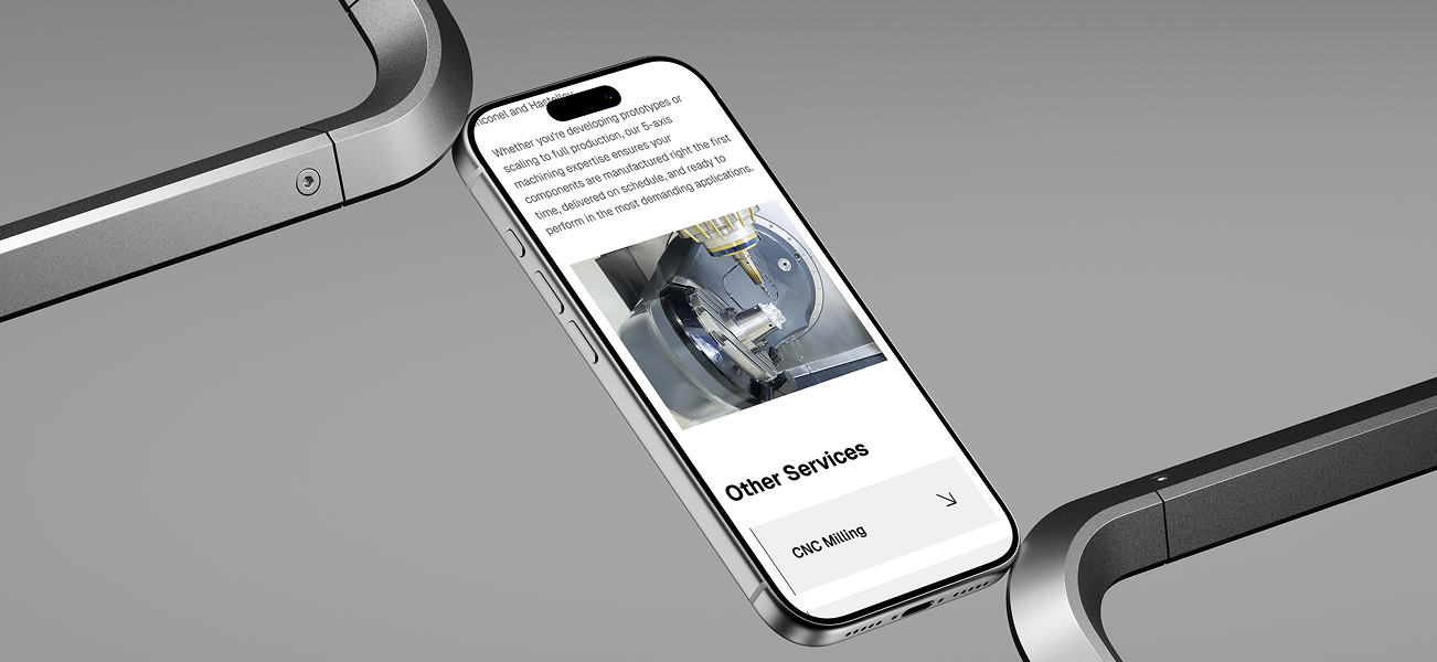
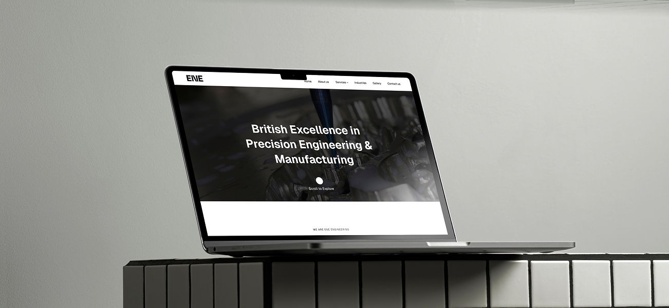
Brand IDENTITY, Website Design
The Challenge
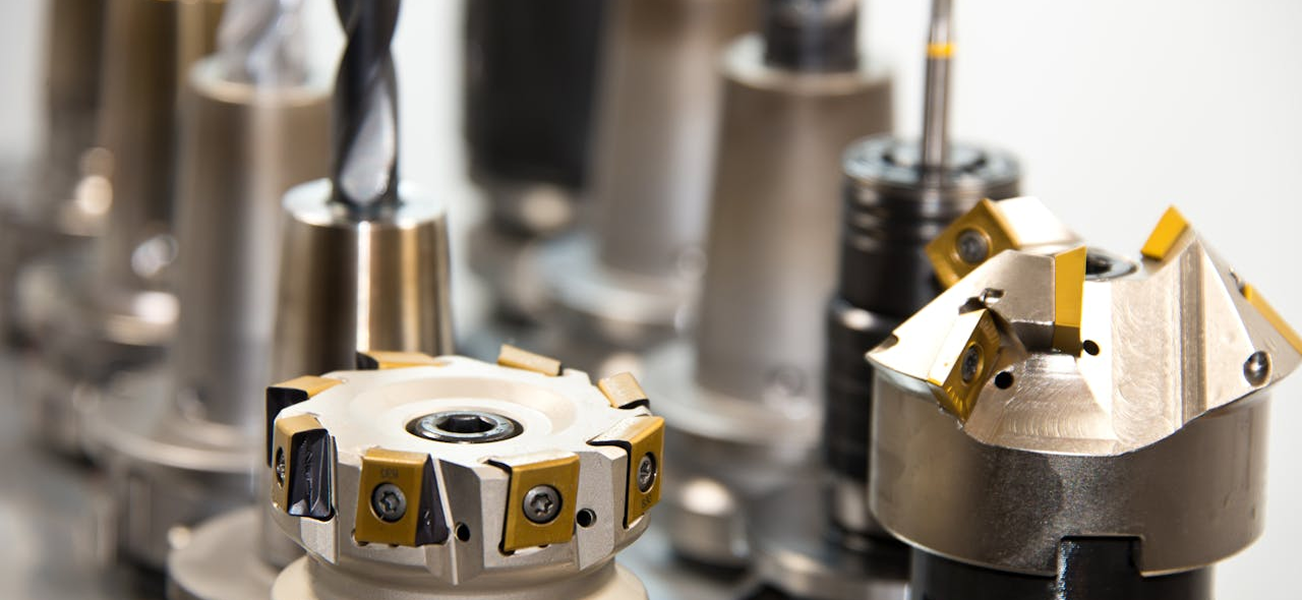
Following a change in ownership, UK-based ENE Engineering faced a pivotal turning point. The company's visual presence felt rooted in the past — failing to reflect the sophisticated, high-speed CNC technology now driving its operations. Legacy branding failed to reflect the precision and authority ENE commanded in the advanced manufacturing sector. New leadership needed to signal a clear transition without alienating the long-term clients who valued the company's mechanical heritage.
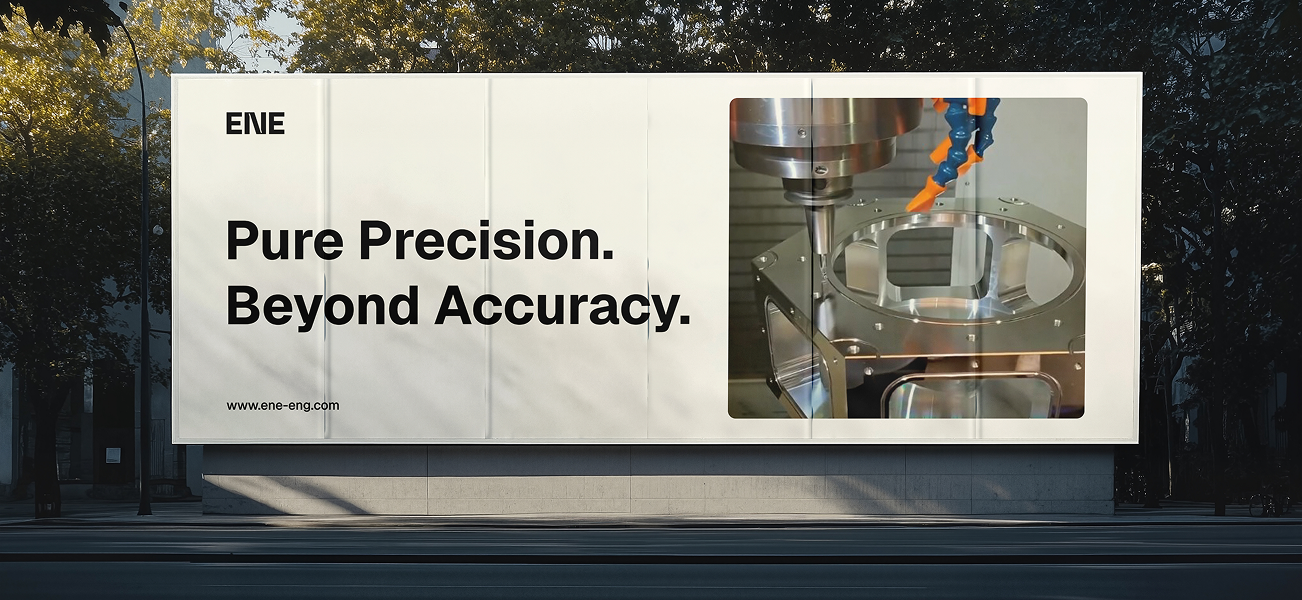
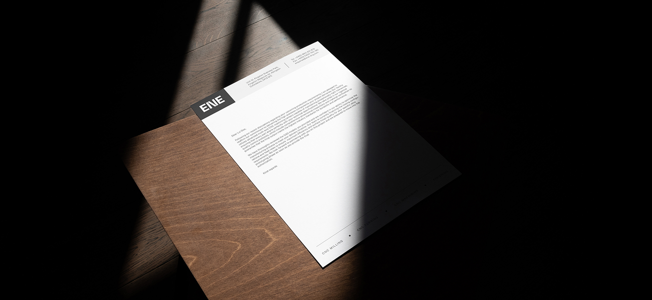
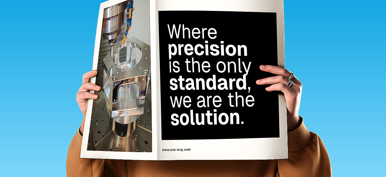
Precision by Design
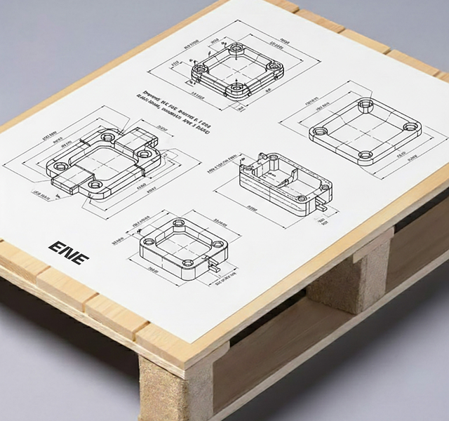
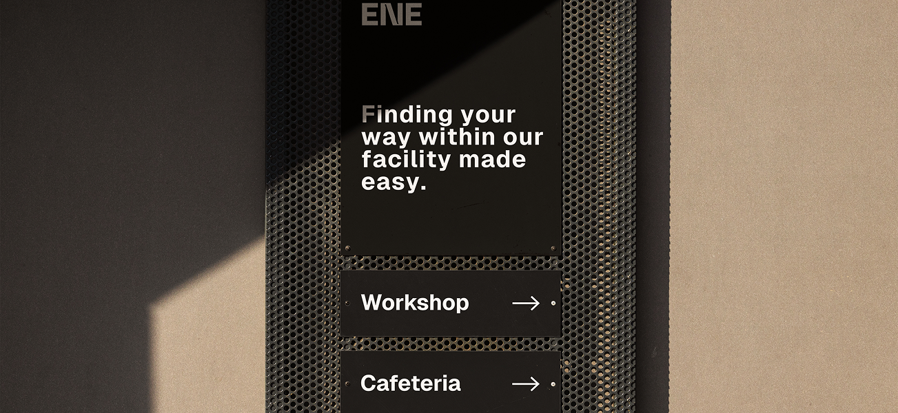
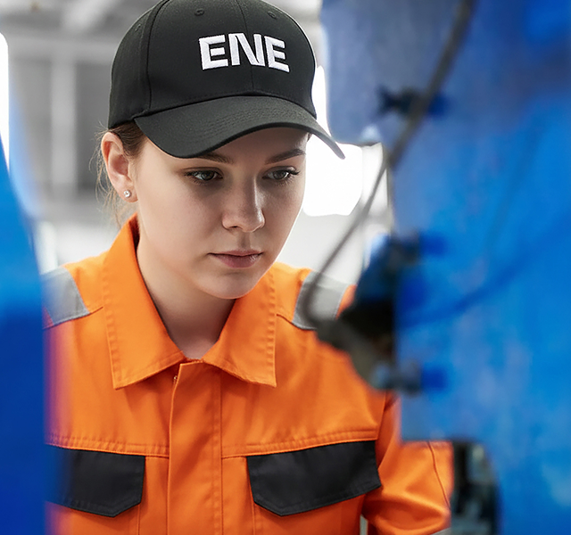
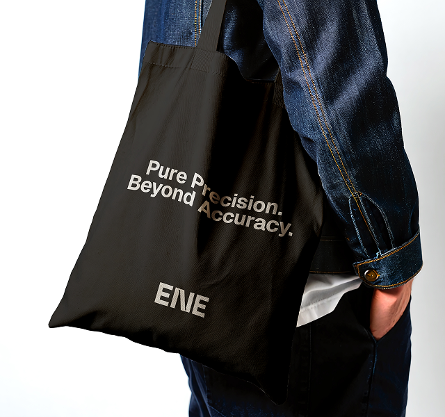
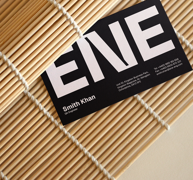
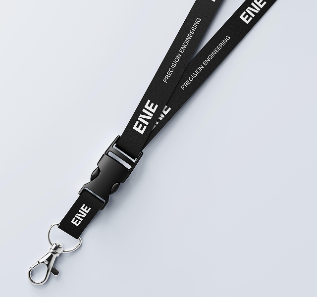
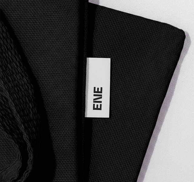
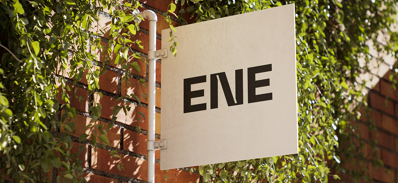
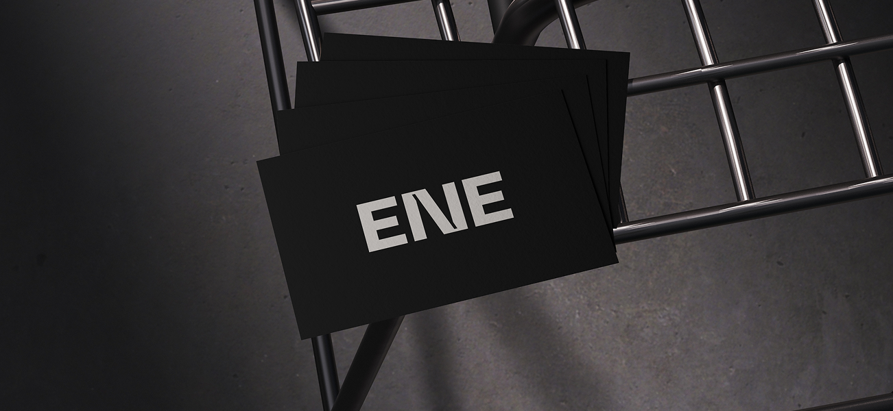
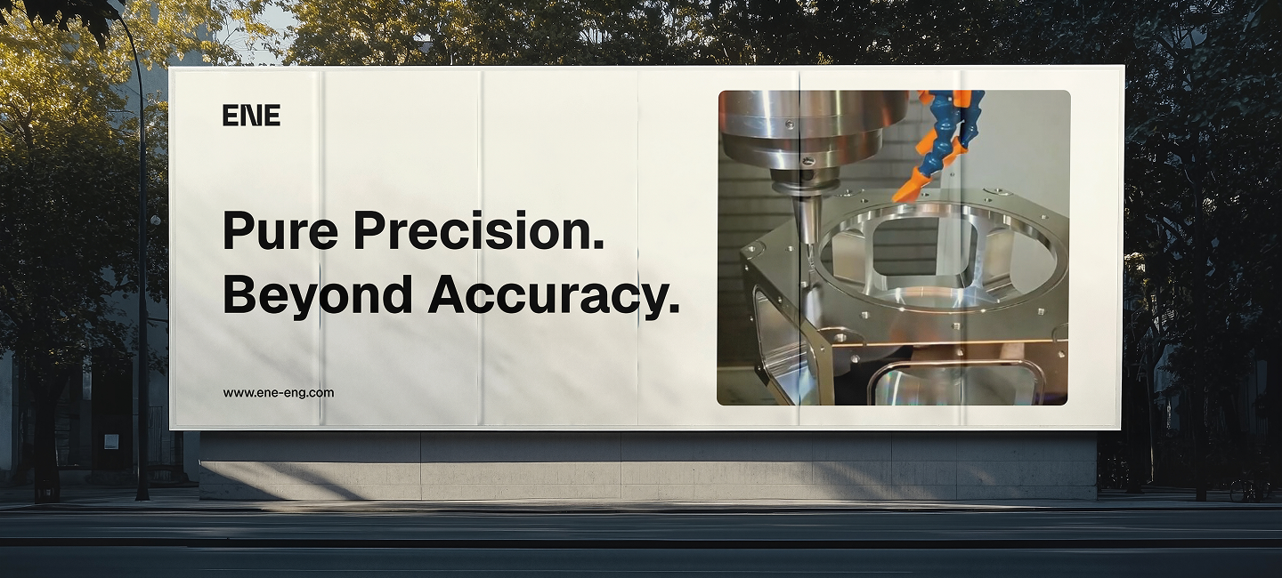
The rebranding strategy was built around a single guiding concept: The Geometry of Precision. A new brand identity was developed, anchored by a minimalist logo that uses negative space to trace a drill bit's path — symbolizing both accuracy and motion. To preserve the brand's core DNA while modernizing its look, the original black color palette was retained, lending a solid, authoritative foundation that speaks to structural strength. Typography was also updated to bridge the gap between digital and physical — evoking stability and structural integrity across every corporate touchpoint.
Impact and Growth
The visual overhaul successfully repositioned ENE Engineering as a top-tier player in the CNC market. Within the first two quarters following launch, the company recorded a 40% increase in RFQs (Requests for Quotes) across its target sectors — an outcome procurement officers directly attributed to ENE's professionalized digital presence.